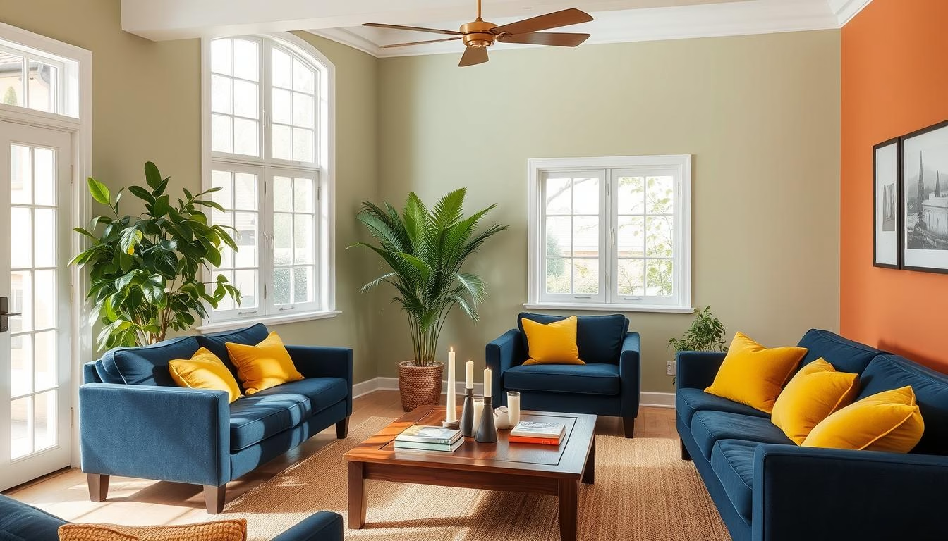
Did you know a simple color change can boost a home’s value by up to 5%? Keeping up with the latest home design trends is key for homeowners. They want to make their living spaces both captivating and modern. The right colors can change the feel and look of any room, from calm neutrals to bold colors.
Key Takeaways
- Trending home colors can significantly impact a home’s value and aesthetic appeal.
- Understanding the latest color trends in home design is essential for creating a modern, cohesive look.
- Neutral tones, bold colors, and earthy hues are some of the popular trending palettes for 2023.
- Incorporating accent walls and playing with textures can help homeowners effectively incorporate trending colors.
- Staying up-to-date with seasonal and nature-inspired color trends can help homeowners achieve a timeless, on-trend look.
The Importance of Color in Home Design
Color is a key element in interior design. It affects how a space looks and feels. Whether you follow the latest interior paint trends or pick a fashionable home decor palette, color can change your home.
How Color Affects Mood
The colors around us can deeply impact our mood. Warm colors like reds and oranges make us feel energetic. Cool colors, such as blues and greens, help us relax. Choosing the right colors for each room can make it feel cozy or calm.
Choosing the Right Palette
Picking the right color palette is essential. Think about the room’s purpose and mood. Choose colors that match your decor and the room’s design. A mix of primary, secondary, and neutral colors can make your space look good together.
| Room | Recommended Color Palette |
|---|---|
| Living Room | Warm neutrals, earthy tones, and pops of vibrant accents |
| Bedroom | Soothing blues, greens, and soft pastels |
| Kitchen | Bright whites, clean grays, and natural wood tones |
Understanding color’s impact can make your home reflect your style and improve your mood.
Neutral Tones for a Modern Look
Neutral tones are a top pick for stylish, timeless interiors. Shades like gray, beige, and off-white are versatile. They let you show your style and make any space modern.
Shades of Gray
Gray is a favorite neutral now, with many sophisticated shades. You can find soft dove grays or bold charcoals. These colors work well with modern furniture, metallics, and natural textures.
Warm Beiges and Off-Whites
Warm beiges and off-whites create a cozy feel. They add depth and keep spaces airy. Pair them with wood, plush fabrics, and a bit of color for a cozy look.
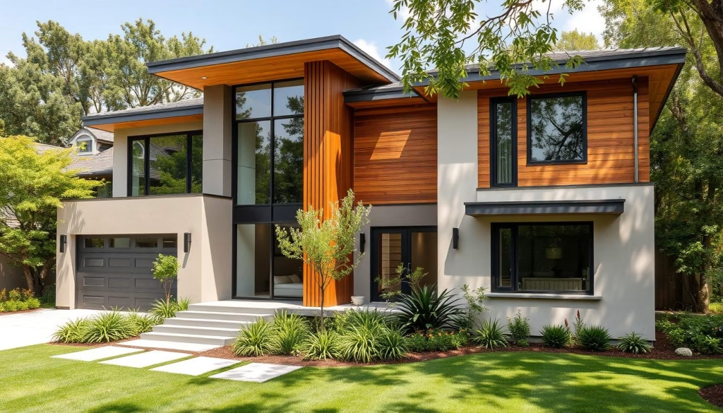
Neutral tones are great for a modern, sophisticated home. Choose from cool grays or warm beiges and off-whites. They’re perfect for your design vision.
Bold Colors Making a Comeback
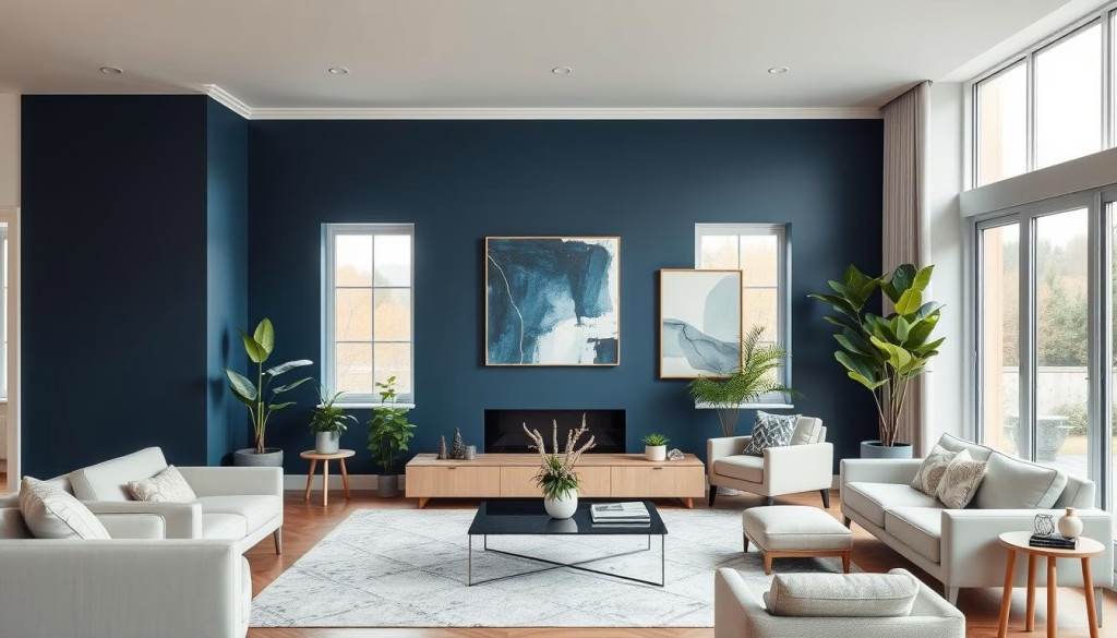
In home design, bold colors are back in a big way. After years of neutral colors, people are now choosing vibrant hues. These colors add depth, drama, and personality to homes. Colors like rich blues, deep greens, and moody reds are changing how we see paint shades.
Vibrant Blues
Neutral blues are out, and bold blues are in. These vibrant colors bring sophistication and elegance to any room. They work well with whites and wood tones, creating a modern look.
Rich Greens
Green is popular again, but now it’s richer and deeper. Shades like forest greens and jade tones bring calm and beauty. They can make a room feel like a spa or add elegance to a formal space.
Deep Reds
Bold reds are back, and they’re making a big impact. These deep reds add a moody vibe to any space. Paired with neutrals, they create a sophisticated and timeless look.
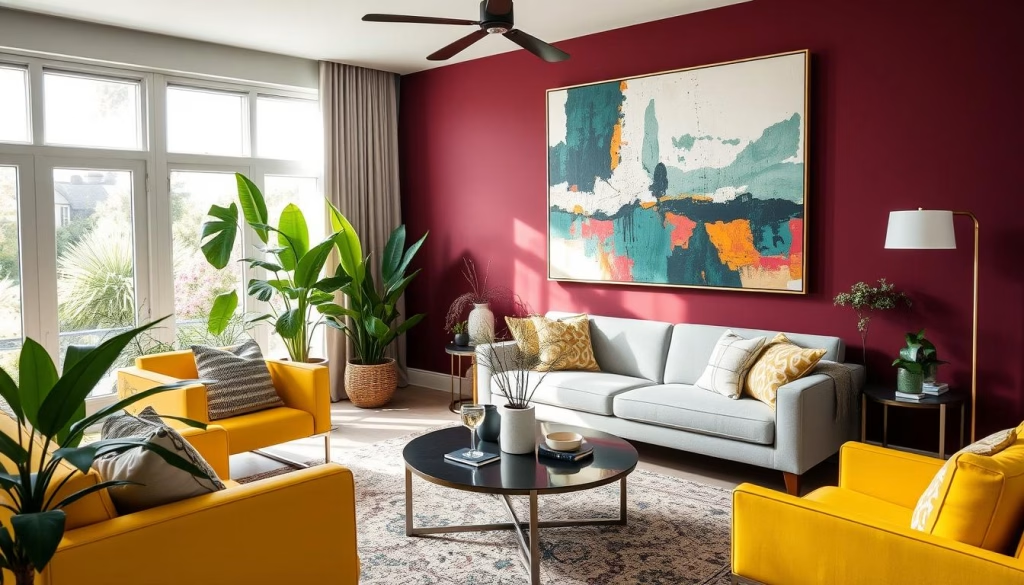
Homeowners are embracing bold colors more than ever. Vibrant blues, rich greens, and deep reds are becoming key elements in home design. They help create unique and stunning spaces that show off personal style.
Earthy Hues for Natural Vibes
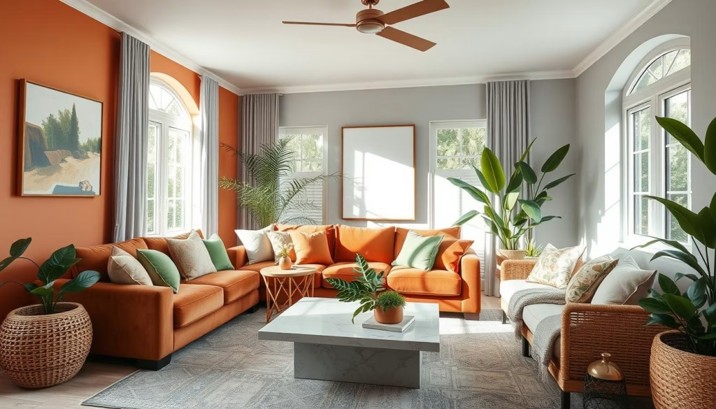
In modern interior design, earthy hues are becoming very popular. Terracotta and olive green are leading colors in this trend. They bring warmth and comfort, and make our homes feel like the outdoors.
Terracotta: The Timeless Terracotta
Terracotta is loved for its warm, rustic feel. It’s often linked to the Mediterranean and Southwest. This color adds depth and character to any room. It can turn a space into a cozy, natural haven.
Olive Green: A Serene Sanctuary
Olive green is a calming color that’s becoming more popular. It’s inspired by olive trees and brings a sense of peace. This color works well with many modern color schemes, making it great for creating a calm atmosphere.
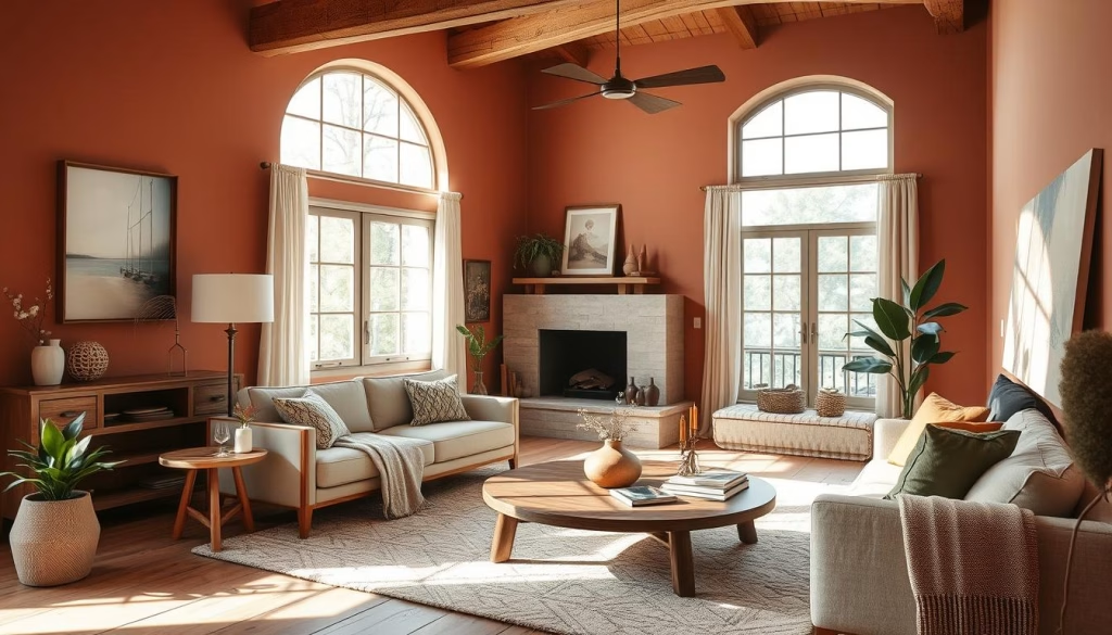
Using earthy colors like terracotta and olive green can make your home feel like a natural oasis. Whether you choose terracotta’s warmth or olive green’s calmness, these colors will refresh your modern color schemes.
Soft Pastels for a Calming Atmosphere
Soft pastels are back in style for home decor. They bring a calm and peaceful vibe to our spaces. These soft colors help us relax and feel at ease in our homes.
Light Pink
Light pink is a favorite for bedrooms and living rooms. It’s soft and romantic, perfect for creating a cozy feel. It’s great for adding comfort and style to your home.
Sage Green
Sage green is loved for its calming effect. It works well in living rooms and dining areas. It brings a natural feel to your space, making it more balanced.
Soft Lavender
Soft lavender is perfect for bedrooms and bathrooms. It promotes relaxation and calmness. Pair it with neutral colors for a soothing look.
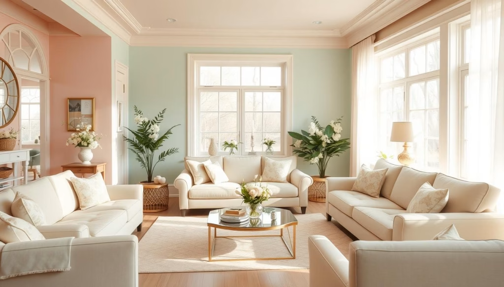
Soft pastels like light pink, sage green, and soft lavender are still popular. They help us relax and create a peaceful home. These colors are essential for a calming atmosphere.
Monochromatic Schemes: A Timeless Approach
Monochromatic color schemes are very popular in homes. They offer a timeless look that makes any room better. This style is known for its elegance and harmony.
Benefits of Monochrome
Monochromatic designs have many advantages. They create a unified look, making the space feel more intentional and sophisticated. This style also brings a calming vibe, perfect for relaxing areas.
Creating Depth with Shades
Monochromatic designs might seem simple, but they’re actually quite complex. Using different shades of the same color adds depth and interest. For example, combining soft gray with charcoal and ivory creates a beautiful space.
Adding various materials and textures makes monochromatic interiors even more interesting. Artwork, lighting, and accessories can also enhance the look. This ensures the space is both captivating and welcoming.
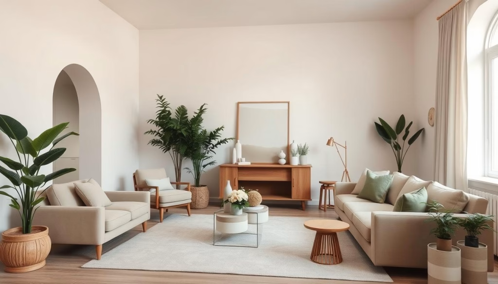
“Monochromatic design is a timeless and sophisticated approach that allows homeowners to create a cohesive and serene living space.”
Monochromatic design is great for those who love calm or bold colors. It’s a journey that can transform any home into a stylish and inviting space.
Accent Walls: A Trend Worth Trying
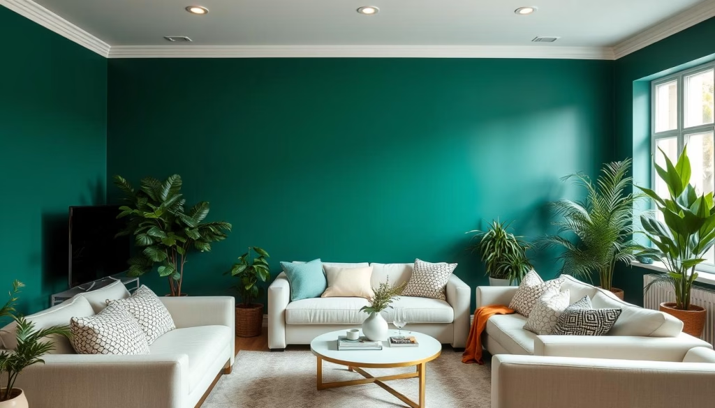
The accent wall trend is changing home design. It makes a room look new and exciting. By using a bold color or texture on one wall, you can make a room stand out.
Popular Colors for Accent Walls
Choosing the right color for an accent wall is fun. Trending home colors like deep blues and rich greens are popular. They make a big statement. Soft colors like lavender and sage green are great for a calm look.
Tips for Perfect Application
Getting an accent wall right takes some planning. Here are some tips for a great look:
- Choose a wall without doors or windows to make the color pop.
- Clean and prime the wall for better paint adhesion.
- Use quality tools for a smooth finish.
- Apply two coats of paint for the best color.
- Match the wall with decor to complete the look.
Accent walls can make your home look modern and exciting. They keep your space looking fresh with the latest trending home colors and hot residential paint shades.
The Role of Textures in Color Perception
When we talk about interior paint trends and fashionable home decor palettes, color and texture are key. The surface a color is on can change how we see it. From matte to glossy, each finish has its own effect.
Matte vs. Glossy Finishes
Matte paint looks soft and velvety, making colors seem more natural. It’s great for cozy spaces like bedrooms and living rooms. Glossy finishes, however, reflect light and make colors pop. They’re perfect for busy areas like kitchens and bathrooms.
Mixing Textures with Color
Adding different textures to your color scheme can really make a room pop. Mixing smooth surfaces with rough ones, like exposed brick or wood, adds depth. This mix of textures can make your interior paint trends and fashionable home decor palettes shine.
“The right combination of color and texture can transform a space from ordinary to extraordinary.”
Try using various materials like matte ceramics, plush velvets, and natural stone. This will create a space that’s both harmonious and visually exciting. It will show off your personal style.
Color Trends Inspired by Nature
Nature-inspired colors are all the rage in modern homes. These nature-inspired color palettes bring a calming vibe. They let homeowners bring the outdoors inside.
Coastal Colors
The coastal palette is a top trend. It features blues, greens, and whites that remind us of the sea. These colors create a peaceful feel. Homeowners can add them through accents or furniture for a beachy look.
Forest-Inspired Palettes
The forest-inspired palette is also popular. It takes cues from the woods, with greens, browns, and warm tones. These modern color schemes make a space feel cozy and calming. They’re great for areas where you want to relax and think.
| Coastal Colors | Forest-Inspired Palettes |
|---|---|
|
|
Using nature-inspired color schemes in your home can make it feel peaceful. It shows your love for nature.
Seasonal Color Trends to Consider
As the seasons change, so do the colors in our homes. These changes can refresh our living spaces and bring balance. Let’s look at how spring’s bright colors and autumn’s warm tones can inspire trending home colors and stylish interior design colors.
Spring Freshness
Spring brings renewal, and its colors are just as refreshing. Think of soft pastels, lively greens, and cheerful yellows. These trending home colors can make a room feel lighter and more optimistic. Use them in accent pieces, textiles, or even a new wall paint.
- Pale blues and soft lavenders for a calming atmosphere
- Verdant greens to bring the outdoors in
- Bright, sunny yellows to uplift the mood
Autumn Warmth
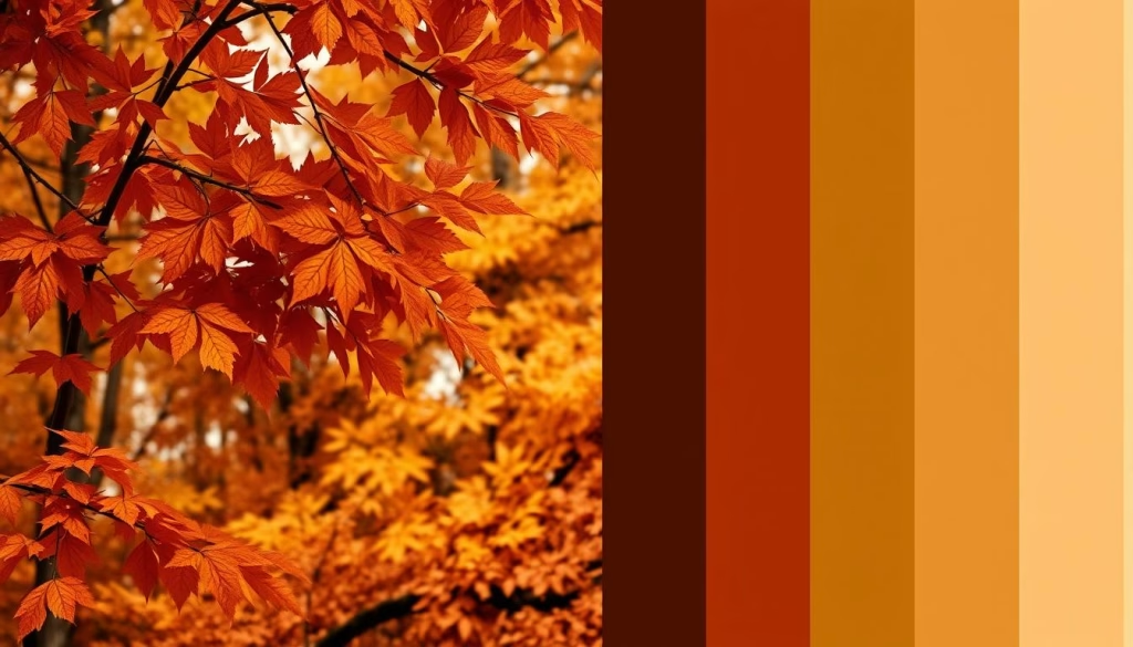
When leaves turn and the air gets crisp, autumn’s colors shine. Rich, earthy tones like deep burgundies, rusty oranges, and moody olives create a cozy feel. Use these colors in textiles, accent walls, or statement furniture to make your home a seasonal haven.
| Color | Inspiration | Complementary Accents |
|---|---|---|
| Terracotta | Baked clay and earthen tones | Warm metallics, natural textures |
| Burnt Sienna | Fallen leaves and autumnal foliage | Deep greens, wood tones |
| Mustard Yellow | Sunny harvest fields | Charcoal grays, navy blues |
By following seasonal color trends, your home can reflect the year’s natural rhythms. It will become a stylish and comforting space for you and your family.
Popular Color Combinations for 2023
As we enter 2023, interior design welcomes a new palette of popular house colors and hot residential paint shades. A standout trend is combining colors in new ways. These combinations can change any room’s look.
Complementary Color Pairings
Complementary colors, opposite each other on the color wheel, create a beautiful balance. Try pairing rich blues with warm ochres or vibrant greens with terracotta. These colors add depth and interest, bringing calm and elegance.
Contrasting Combinations
Bold, contrasting colors are also popular. Imagine deep burgundies with soft lavenders or tangerine with sage greens. These bold pairs bring energy and fun, ideal for those who want to stand out.
| Complementary Pairings | Contrasting Combinations |
|---|---|
|
|
Whether your style is classic or modern, using these popular house colors and hot residential paint shades can make your home stand out in 2023.
“Embracing color combinations is the key to creating a truly dynamic and personalized home.”
How to Incorporate Trending Colors into Your Home
Updating your home’s color scheme with the latest trends can seem daunting, but it doesn’t have to be. Whether you’re a seasoned DIY enthusiast or a beginner painter, there are plenty of ways to incorporate fashionable home decor palettes into your living spaces.
Painting Tips for Beginners
One of the easiest ways to transform your home’s look is through a fresh coat of paint. If you’re new to the world of interior painting, start by familiarizing yourself with the latest interior paint trends. Research popular colors and color combinations that align with your personal style and the desired atmosphere in your rooms. Once you’ve selected your hues, gather the necessary supplies and follow these beginner-friendly painting tips:
Proper surface preparation is key to achieving a professional-looking finish. Thoroughly clean and sand the walls before applying primer and paint. This helps the new color adhere evenly and reduces the risk of visible brush strokes or uneven coverage. When it comes to application, use high-quality brushes and rollers for a smooth, seamless result. Take your time and apply multiple thin coats rather than one thick layer for the best fashionable home decor palettes.
FAQ
What are the latest trending home colors that can transform my living space?
The latest home colors include bold hues like deep blues and rich greens. Earthy terracotta and calming pastels like light pink are also trending. Neutral tones like gray and beige offer a modern look.
How does color affect the mood and atmosphere in my home?
Colors greatly impact your home’s mood and atmosphere. Warm tones like reds create coziness. Cool colors like blues bring tranquility. Neutral colors add sophistication.
What are the key considerations when choosing a color palette for my home?
Consider the room’s purpose and natural light when picking colors. Your personal style is also key. Mixing shades and textures adds interest.
Why are neutral tones like gray, beige, and off-white so popular in modern home design?
Neutral tones are timeless and versatile. They let other design elements shine. Shades like gray and beige are sophisticated and adaptable.
What are some of the bold, vibrant colors making a comeback in home design?
Bold colors like deep blues and rich greens are back. These colors add interest and create focal points. Use them on walls, furniture, or decor.
How can I incorporate earthy, nature-inspired hues like terracotta and olive green into my home?
Use earthy hues for a warm atmosphere. They pair well with wood and stone. Incorporate them through paint, textiles, and decor.
What are the benefits of using soft, pastel colors in my home design?
Pastel colors like light pink create calmness. They’re perfect for bedrooms and living rooms. These colors promote relaxation.
How can I effectively use a monochromatic color scheme in my home?
Monochromatic schemes are timeless. Use different shades and textures of one color. Mixing finishes adds depth and interest.
What are the benefits of using an accent wall in my home?
Accent walls add color without overwhelming the space. They create focal points and add interest. Choose bold or earthy colors.
How do different paint finishes and textures affect the perception of color in my home?
Finishes and textures change how colors appear. Matte finishes soften colors, while glossy makes them pop. Mixing finishes adds depth.
What are some nature-inspired color trends that I can incorporate into my home?
Try coastal or forest-inspired colors for a calming atmosphere. These colors connect your home to nature. They’re perfect for creating harmony.
How can I incorporate seasonal color trends into my home decor?
Update your home with seasonal colors. Spring brings fresh hues, while autumn offers earthy tones. Use throw pillows and curtains to change your look.
What are some of the most popular color combinations for home design in 2023?
Popular combinations include blues and oranges, and greens and pinks. These pairings create striking and harmonious spaces.
As a beginner, how can I successfully incorporate trending colors into my home?
Start with small projects like accent walls. Use paint samples to test colors. Ensure your colors match your home’s design for a cohesive look.


